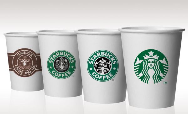
Starbucks is the largest coffee maker and retailer in the world with close to 36,000 locations! Whether you’re a regular java customer or have just driven past a Starbucks on your way to work, you’ve seen their logo; that green mermaid image with long, wavy hair. There are some details behind that famous logo that could make you think twice before ever ordering that Starbucks hot steamy tall blonde vanilla latte, oozing with caramel and topped with succulent whipped cream.
That image in the center of the Starbucks logo is not a mermaid. She’s actually a mythological Siren, a female creature that lured mariners to destruction by her sex appeal and singing. In Greek mythology, the Sirens were dangerous yet beautiful creatures who enticed nearby sailors to shipwreck on the rocky coast and die. A noted British author remarked, “Their song, though irresistibly sweet, was no less sad than sweet, and lapped both body and soul in a fatal lethargy, the forerunner of death and corruption.” The term “Siren Song” refers to an appeal that is hard to resist but that, if heeded, will lead to a bad result. Today, statues of Sirens can be found at graveyards in Greece, Italy, and Asia, as they are believed to accompany the dead to the afterlife.
YIKES! What the heck does this evil seductive creature have to do with Starbucks coffee??
Starbucks got its name from the author Herman Melville’s Moby Dick novel. However, the famous Siren logo came to fruition after the founders discovered her image while scouring old marine books. In 1971, the original Starbucks opened in the port city of Seattle. Since coffee beans typically traveled overseas on large container ships, the founders decided to use a “seductive siren” logo that would lure coffee lovers to its stores. And seductive she was…
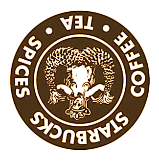
The original Starbucks logo was a bare-breasted, female Siren with two serpentine tails spread apart. It’s strikingly similar to the Hortus Sanitatis image from 1491.
![]()
![]()
Hortus Sanitatis image from 1491 Starbucks Logo 1971
In an article published by Revealing Truth, it was claimed that the Starbucks logo also has sinister roots. By turning the original Starbucks logo upside down, you can see the image of satan. In 2014, Starbucks got into trouble after its employees were drawing satanic pentagrams and the number "666" in the foam of coffee.
The twin tails of the Siren become the horns of satan when turned upside down
Okay, let's get back to the Siren. In 1484, the first printed book in Sweden illustrated the morality of a sailor and the seductive topless Siren. It was claimed that no man could resist her enticing power of persuasion.
![]()
Dyalogus creaturarum moralizatus, 1484
According to mythology, Sirens would expose their bare breasts to sailors promising to grant them anything they desired if they would come to shore and help them. In this hypnotic trance, and with the sailor's guard down, they would run into the rocks and their ship would be broken into pieces. Many sailors would tie themselves to the mast of the ship to make it difficult for them to fall prey to the temptations of the Siren.
In 1987, the logo went from brown to green and the Siren’s fully exposed perky breasts were now covered by her hair. However, more emphasis was being placed on her crotch area which now had a triangular shape with a hole in the center. Her arms aid in helping spread apart her two serpentine tails into a Yoga Baby Pose position. A Christian group based in San Diego created a movement calling for a national boycott of the coffee-selling giant. Spokesperson Mark Dice stated, “The Starbucks logo has a naked woman on it with her legs spread like a prostitute… the company might as well call themselves Slutbucks.” Harvard symbolist Gary L. Blankstein said,
“In ancient folklore, Sirens were believed to be the bodies of deceased prostitutes, possessed by the devil to seek revenge on unfaithful sailors.”
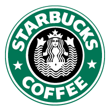
Starbucks Logo 1987
All the negativity finally convinced Starbucks to tone things down. In 1992, the Starbucks logo cropped out the seductive Siren spreading apart her two legs (Uhm, I mean tails), and her torso and crotch shot was also removed from the frame. They were finally leaving a latte to the imagination.
Starbucks Logo 1992
To celebrate its 40th anniversary, Starbucks did a minor logo redesign. The Siren’s “naughty parts” still remained covered and cropped out and the words “Starbucks coffee” were removed. This decision was based on the fact that Starbucks was now selling many things beyond just coffee and they wanted to expand their brand.
Starbucks Logo 2011
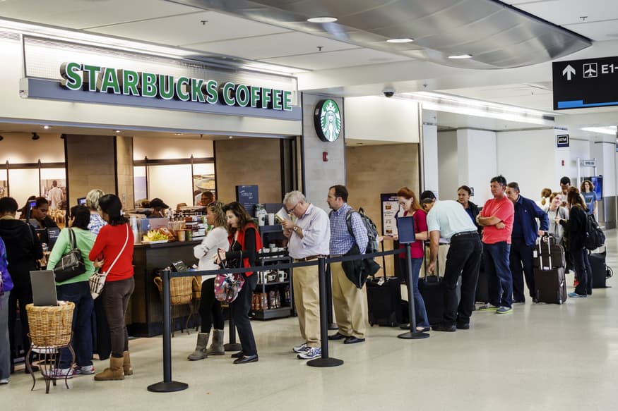
Today, the seductive Siren is now G rated and is no longer luring customers to enjoy a hot and steamy cup of java. Or is she? Something is sure creating those long lines wrapped around their buildings that no other coffee house can seem to duplicate. Some say it's the great coffee they serve but many others still believe it's the irresistible power of their green logo. 


|
Sign up to get Dr. David Friedman's health and wellness tips, featured videos, articles and podcasts!
© 2026 DrDavidFriedman.com All rights reserved. Website created by Dotlogics
About the Author
Dr. David Friedman is the author of the award-winning, #1 national best-selling book Food Sanity, How to Eat in a World of Fads and Fiction. He's a Doctor of Naturopathy, Chiropractic Neurologist, Clinical Nutritionist, Board Certified Alternative Medical Practitioner, and Board Certified in Integrative Medicine. Dr. Friedman is a syndicated television health expert and host of To Your Good Health Radio, which has changed the face of talk radio by incorporating entertainment, shock value, and solutions to everyday health and wellness issues.
Read more hereFOODSANITY.COM .